Client Work
Brands Built With Their Reasons.
A look at the work behind our approach. Each project shows the identity we built and the thinking we wrote down with it, so the brand can carry forward without us in the room.
Case study 01
Kindall: Identity and Brand Context System.
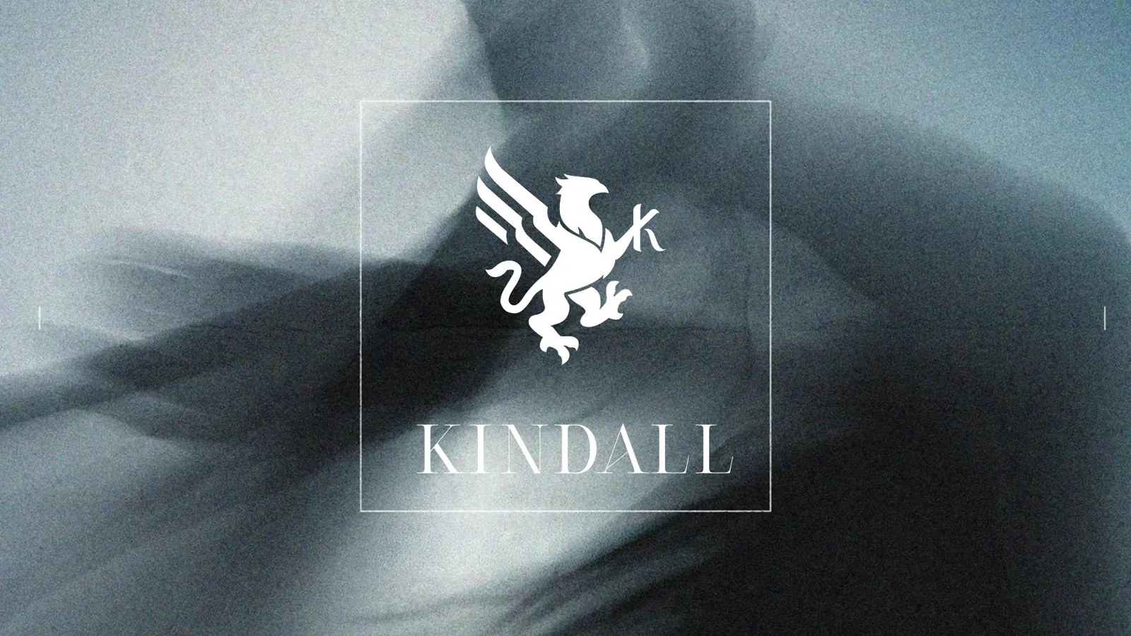
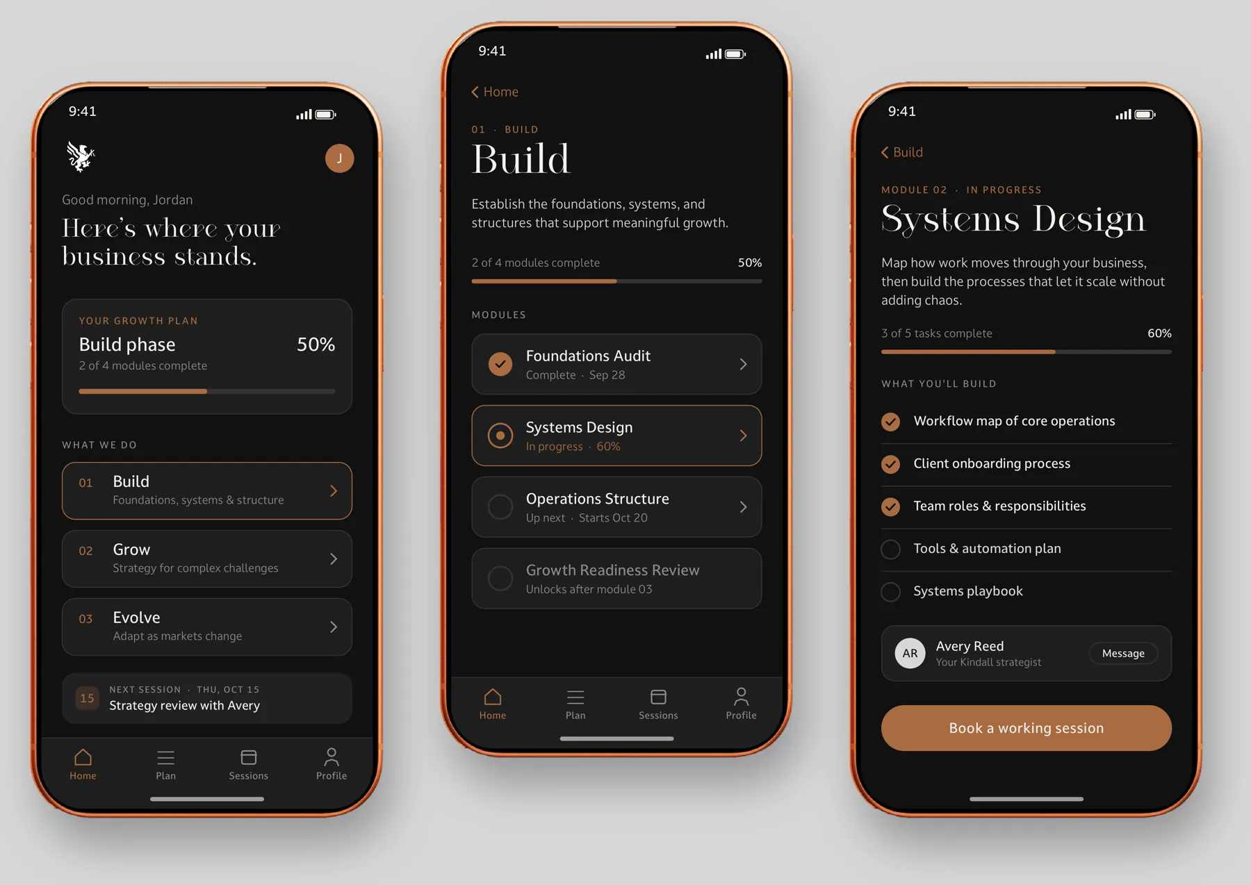
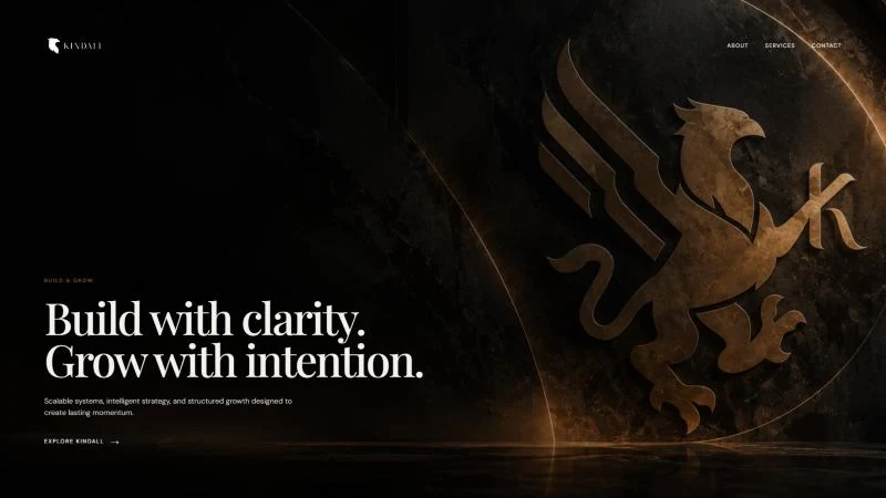
Kindall helps organizations build the systems, strategy and structure they need to grow. During a design internship there, Lamanda Stone served as acting creative director and built Kindall’s visual identity from the ground up: a griffin mark for guardianship, a custom wordmark and K symbol, a warm and grounded palette, a supporting icon system, and a voice that feels confident and advisory rather than institutional.
Kindall planned to produce much of its work with AI tools, so the identity needed more than a style guide. Lamanda paired it with a brand context system that records the reasoning behind each decision, so people and tools apply the brand the same way.
- Client
- Kindall
- Role
- Acting creative director
- Delivered
- Identity and Brand Context System
- Audience
- Growing businesses
Completed by Lamanda Stone during her design internship at Kindall, before Arkenstone Consulting was founded. Shown with Kindall’s permission.
Building the identity
From Reference Board to Finished Mark.
-
 01
Research and Sketches
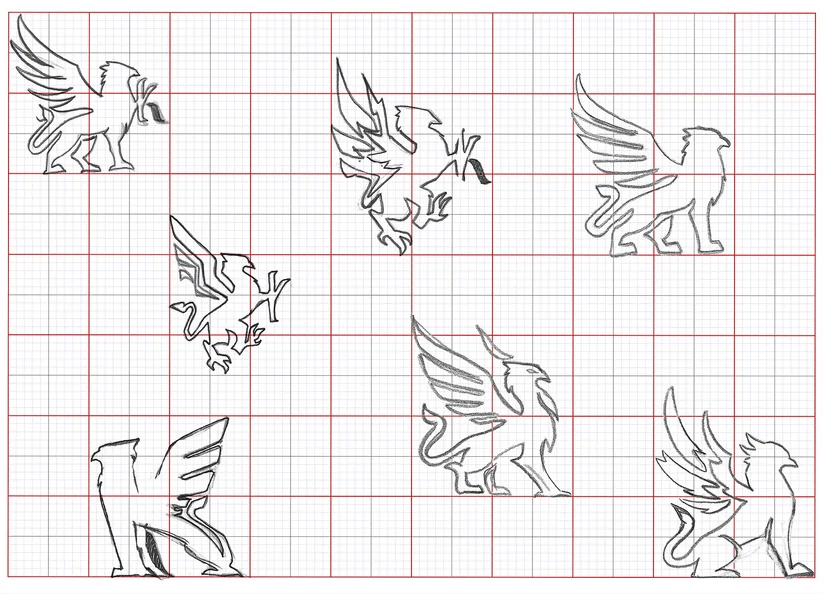
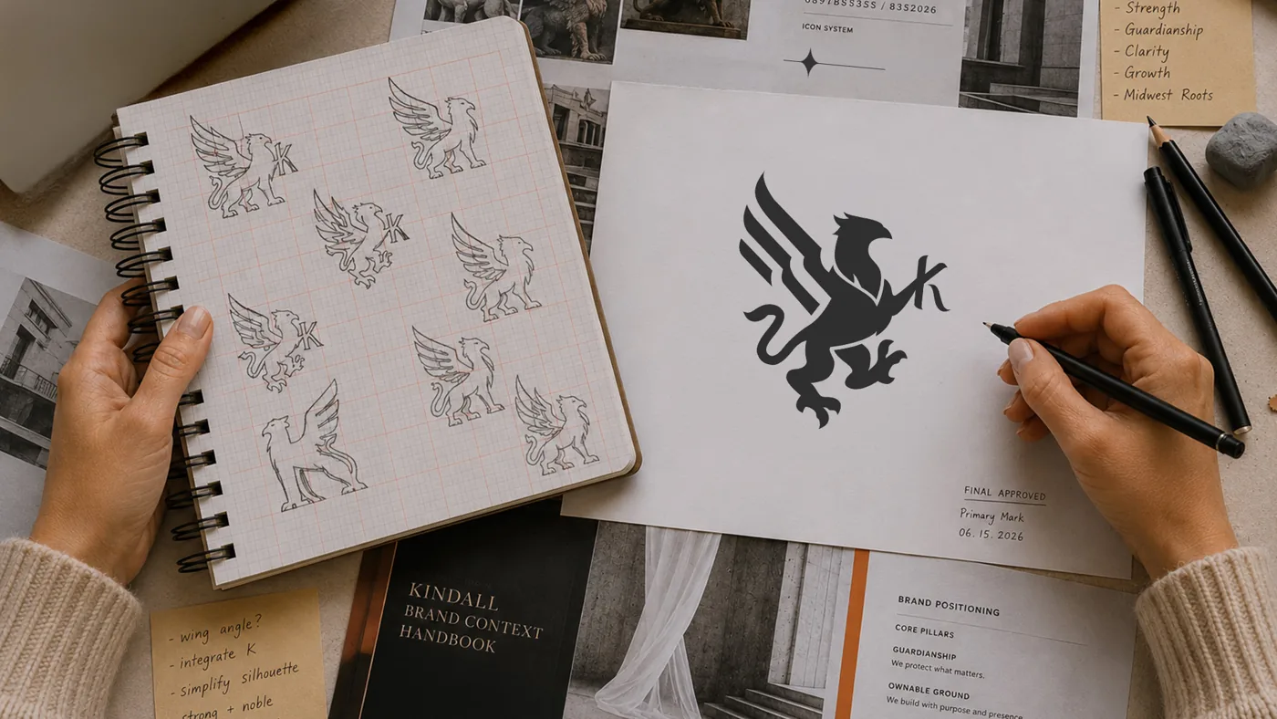
A board of twenty existing griffin marks showed which qualities fit Kindall. Hand-drawn explorations followed, and the strongest direction was refined through feedback and critique.
-
 02
The Mark and Wordmark
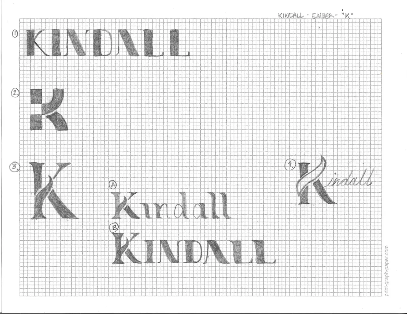
The letter K was worked into the griffin’s raised claw, then proportions and curves were adjusted until the mark held at every size. The wordmark and K symbol were drawn by hand on grid paper before going digital.
-
 03
The Logo System
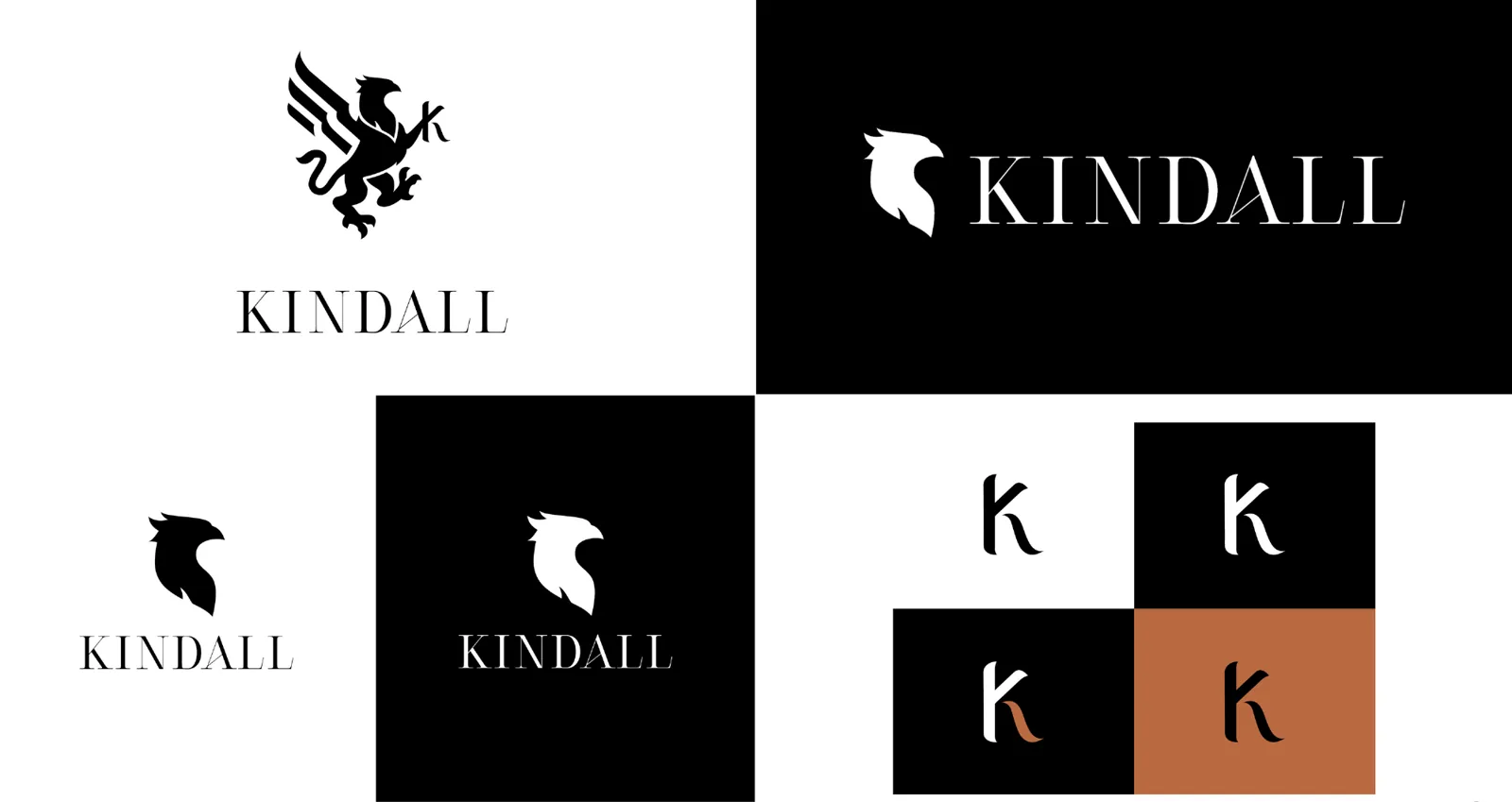
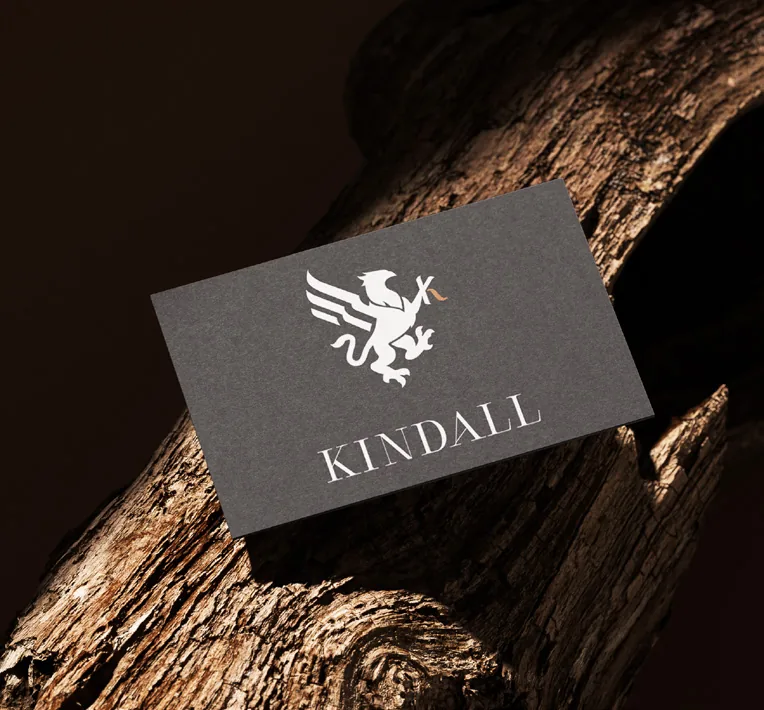
A primary logo, a horizontal secondary lockup and a standalone K symbol, each with clear rules for placement, clear space and background.
-
 04
Color Palette
A restrained palette anchored in deep neutrals, with an ember copper accent that carries warmth across every application.
- Copper #B96A41
- Warm Taupe #665E52
- Deep Charcoal #162127
- Slate #3C4C55
- Light Gray #C5C7C6
-
 05
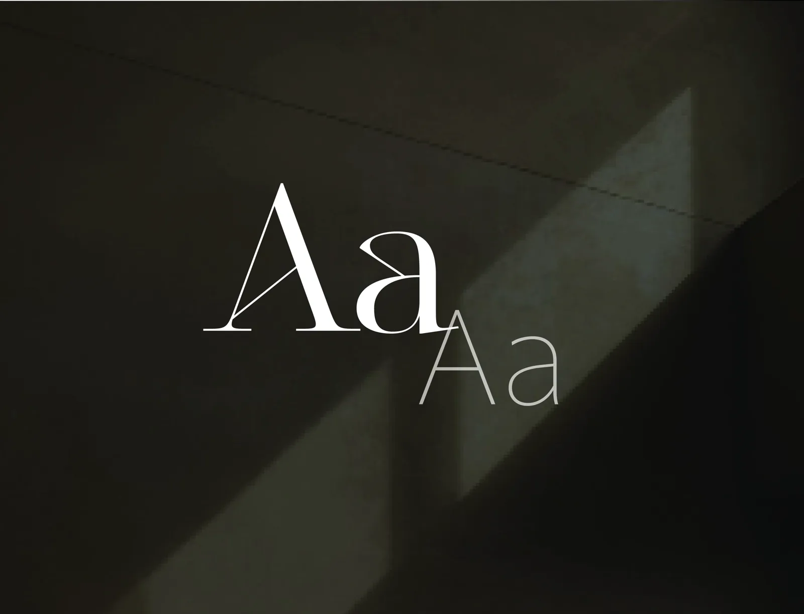
Typography
Authority through restraint. Cesso, the primary display face, carries editorial statements, chapter headings and the wordmark. Darkmode, the supporting face, brings clarity to body copy, subheads, captions and digital interfaces.
-
 06
Icon System
A supporting visual language built from a star and connecting lines: the star for moments of insight and growth, the lines for the structured paths that turn ideas into measurable results.
The reasoning
The Brand Context Handbook.
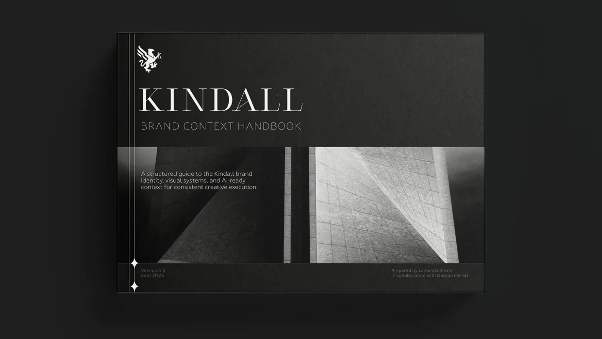
A style guide tells people what to do. Kindall’s brand also needed to explain why, in a form both people and AI tools could follow.
The result was the Kindall Brand Context Handbook: the brand’s philosophy, positioning, voice and visual identity, with the reasoning behind each decision, so people and tools could carry the brand forward without guessing.
The work
One System, Every Touch Point.
Griffin mark, from sketch to final
Business card
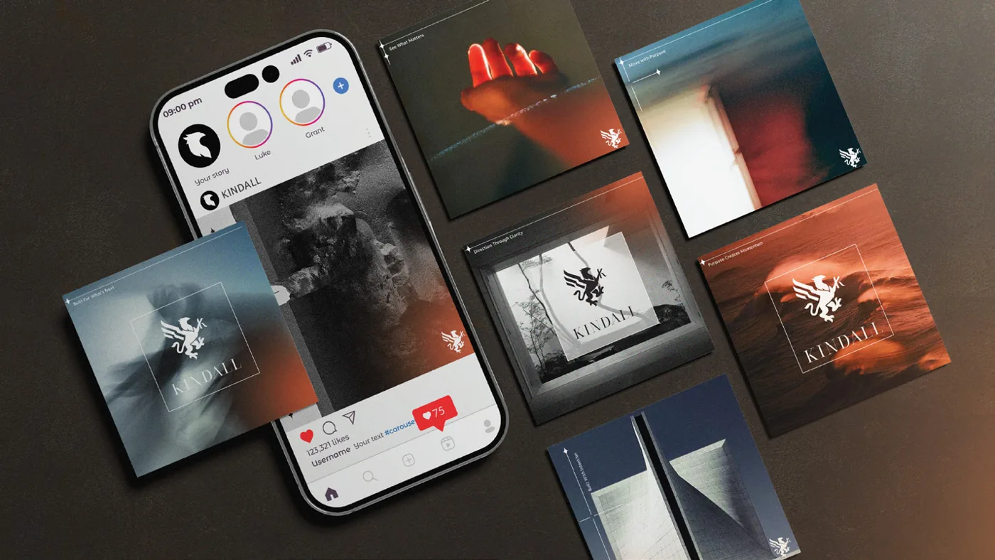
Social templates
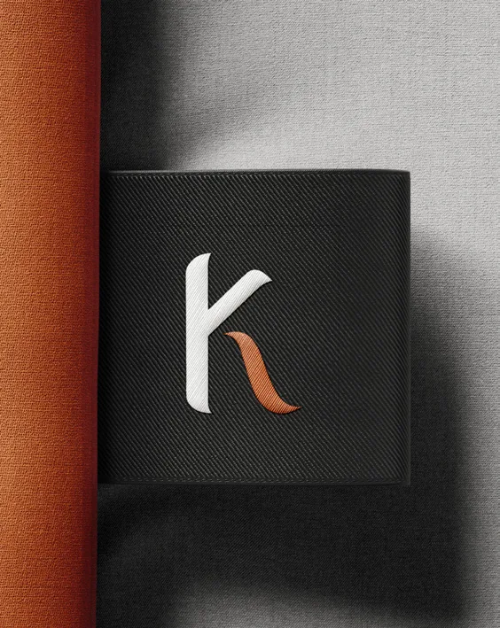
The K symbol
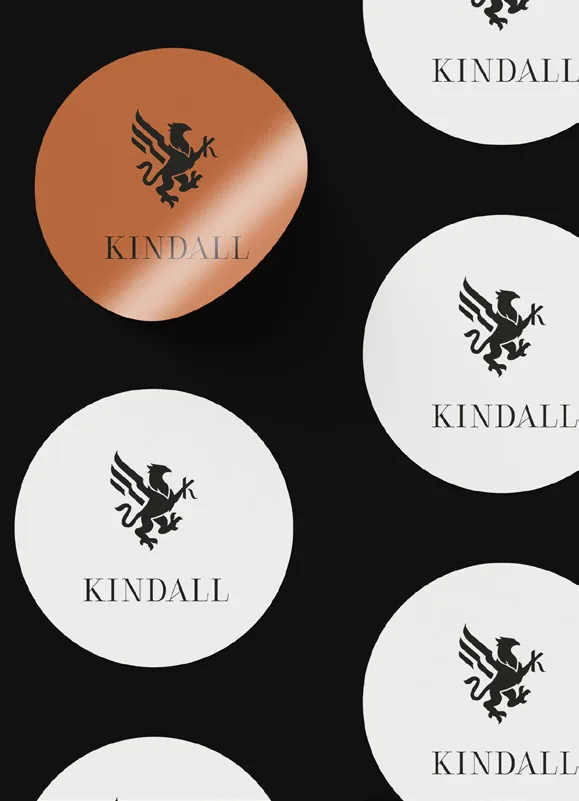
Stickers

Merchandise
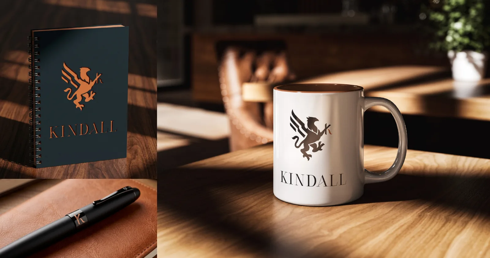
Stationery and merchandise
Website · View the live site
What it showed us
Guidelines Say What. The Reasons Keep It Whole.
Kindall’s identity was clear, and a style guide alone still was not enough to keep it consistent once new people and new tools began producing the work. What held the brand together was the record of why each decision was made.
Our work today builds on that same idea: we look for what your brand means, write down the reasoning behind it, and hand you a system your people and your tools can follow.

Start With a Conversation.
Tell us where your brand is today. We will recommend where to begin, or tell you if you do not need us yet.
Let’s talk See services and pricing